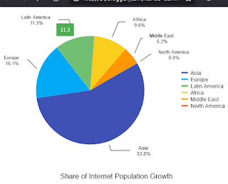
This article is an example of a donut Kendo Chart Component. The framework used is Kendo UI for jQuery. Strangely enough, a 0% value isn't displayed by a donut Kendo Chart but is displayed by a pie Kendo Chart. In this example, we will make the donut Kendo Chart display the 0% value.
Before we go straight to the solution, let us see the problem first. Set the "North America" value to 0, value: 0 and make sure the type is "donut", type: "donut".
We should have something like below:
 |
| Donut Kendo Chart Missing 0% |
Now, keep everything the same and change the type to pie, type: "pie" and we should have something like below:
 |
| Pie Kendo Chart Showing 0% |
See the difference? On a pie Kendo Chart, 0% is shown. On a donut Kendo Chart, 0% isn't shown. Even though they have the same values. Don't ask me why because I don't know the reason behind it. Fortunately, we can trick the Kendo Chart into showing the 0% value.
Here is our solution. You can edit the code below using any text editor but I prefer Visual Studio Code. Make sure you are connected to the Internet because the code pulls the Kendo library from the Telerik CDN. Take note that this is just a demonstration code and you'll need to purchase a license if you are going to use Kendo UI for jQuery for more than just evaluation purposes.
The trick is to change the value to something way below zero. In our example it is 0.001. So we set "North America" to value: 0.001. And then handle the tool tip and label by adding some template logic. Don't forget to set type: "donut". This is how it looks now:
 |
| Donut Kendo Chart Showing 0% |
There you have it. A quick and simple example of a Kendo Donut Chart with 0%.
