Showing posts with label kendo chart. Show all posts

Thursday, December 16, 2021

Kendo Donut Chart With Borders Example

This article is an example of a Kendo Chart Component with borders. The framework used is Kendo UI for jQuery.

Suppose we have a highly customizable widget that displays a donut Kendo Chart with borders and background colors. Let's just imagine that there is an admin page where you can input the desired background color and border for the widget. Okay? So, we'll have something like below.

Donut Kendo Chart With Borders
Kendo Chart Overlapping Borders

As you can see, the borders are being overlapped by the chart. This does not look good. Now this can easily be fixed by setting the chartArea.background to transparent. Like what you see below. But the tricky part is this is a highly customizable widget wherein the the container and the donut Kendo Chart area can have different colors. What are we going to do?

Donut Kendo Chart With Borders
Kendo Chart Transparent Chart Area

Here is our solution. You can edit the code below using any text editor but I prefer Visual Studio Code. Make sure you are connected to the Internet because the code pulls the Kendo library from the Telerik CDN. Take note that this is just a demonstration code and you'll need to purchase a license if you are going to use Kendo UI for jQuery for more than just evaluation purposes.

We'll need to implement the render function. In this function, we find the SVG of the chart and apply the border styling as appropriate. We should have something like below. As you can see the chart area color is different from the caption area background color. The borders are not overlapped as well. Great!

Donut Kendo Chart With Borders
Kendo Chart with Borders

There you have it. A quick and simple example of a donut Kendo Chart with borders.

Saturday, September 18, 2021

Donut Kendo Chart with 0% Example

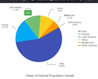
This article is an example of a donut Kendo Chart Component. The framework used is Kendo UI for jQuery. Strangely enough, a 0% value isn't displayed by a donut Kendo Chart but is displayed by a pie Kendo Chart. In this example, we will make the donut Kendo Chart display the 0% value.

Before we go straight to the solution, let us see the problem first. Set the "North America" value to 0, value: 0 and make sure the type is "donut", type: "donut".

We should have something like below:

Donut Kendo Chart with 0% Example
Donut Kendo Chart Missing 0%

Now, keep everything the same and change the type to pie, type: "pie" and we should have something like below:

Donut Kendo Chart with 0% Example
Pie Kendo Chart Showing 0%

See the difference? On a pie Kendo Chart, 0% is shown. On a donut Kendo Chart, 0% isn't shown. Even though they have the same values. Don't ask me why because I don't know the reason behind it. Fortunately, we can trick the Kendo Chart into showing the 0% value.

Here is our solution. You can edit the code below using any text editor but I prefer Visual Studio Code. Make sure you are connected to the Internet because the code pulls the Kendo library from the Telerik CDN. Take note that this is just a demonstration code and you'll need to purchase a license if you are going to use Kendo UI for jQuery for more than just evaluation purposes.

The trick is to change the value to something way below zero. In our example it is 0.001. So we set "North America" to value: 0.001. And then handle the tool tip and label by adding some template logic. Don't forget to set type: "donut". This is how it looks now:

Donut Kendo Chart with 0% Example
Donut Kendo Chart Showing 0%

There you have it. A quick and simple example of a Kendo Donut Chart with 0%.

Wednesday, August 18, 2021

Kendo Chart with Filter Example

This article is an example of how to filter a Kendo Chart Component. The framework used is Kendo UI for jQuery. In this example, we learn a bunch of things. First, we will learn how to extend a Widget class to create our own custom widget. One reason why we create our own widget is when we would like to use it in our other projects. Second, triggering events so that our custom widget can handle the event. Lastly, utilizing the Kendo DataSource component to filter our Kendo Chart.

First off, we place our custom widget inside an immediately invoked function expression and pass in jQuery. We extend the base Kendo Widget class in the kendo.ui namespace. Next, we provide an init method. The element parameter is where we are initializing the widget to. The options are configuration values for our widget and are then merged to the base options. We add our custom UI code, _create and in order for the client code to get the filter when the Kendo Button is clicked, we trigger the attached event so that the client code can handle the event. Lastly, we add the widget to Kendo UI, plugin. Our widget is now available to use like all other Kendo UI widgets.

my-widget.js

In our HTML, we bind our array to a Kendo DataSource. We create our custom filter the same way we create other Kendo widgets and implement the code to handle the applyFilter event. And then we bind the dataSource to Kendo Chart.

kendo-chart-with-filter.html

This is how it looks like on initial load.

Kendo Chart with Filter
Kendo Chart with Filter - Initial Load

This is how it looks like filtered.

Kendo Chart with Filter
Kendo Chart with Filter - Filtered

There you have it. A quick and simple example of how to filter a Kendo Chart.

Saturday, August 7, 2021

Kendo Chart Custom Visual Image Example

This article is an example of creating a custom visual image in a Kendo Chart Component. The framework used is Kendo UI for jQuery. In this example, our requirement is to show an image when a chart hits a certain point. Say for example when the values hit below 30, it will show a life saver icon. Telling the user that the value needs to be looked into so to speak.

What we need to do is implement a function for the visual option. We call the createVisual() function to save us from computing where to put the label and icon. Looping through the visual.children and finding the Text nodeType will give us the bounding box (position) coordinates for our label and icon. When we have the coordinates, we utilise Kendo's drawing API to draw the label and icon and return it as a Group object.

Here is our solution. You can edit the code below using any text editor but I prefer Visual Studio Code. Make sure you are connected to the Internet because the code pulls the Kendo library from the Telerik CDN. Take note that this is just a demonstration code and you'll need to purchase a license if you are going to use Kendo UI for jQuery for more than just evaluation purposes.

Result:

Kendo Chart Custom Visual Image Example
Kendo Chart Custom Visual Image

There you have it. A quick and simple example of how to create custom visual image in Kendo Chart.

Thursday, July 1, 2021

Kendo Chart Curved Edge Label Example

This article is an example of creating a customised visual label with curved edges in a Kendo Chart Component. The framework used is Kendo UI for jQuery. In this example, our requirement is to show values inside an orange  box with curved edges if it is equal to 10. This builds upon my previous example, Kendo Chart Custom Visual Label Example.

What we need to do is implement a function for the visual option. We call the createVisual() function to save us from computing where to put the label. This will give us the bounding box coordinates for our label and rectangle. When we have the coordinates, we utilise Kendo's drawing API to draw the text and rectangle and return it as a Group object. Instead of the utilizing the kendo.drawing.Rect object, we use the kendo.drawing.Path object to create a rectangle with curved edges.

Here is our solution. You can edit the code below using any text editor but I prefer Visual Studio Code. Make sure you are connected to the Internet because the code pulls the Kendo library from the Telerik CDN. Take note that this is just a demonstration code and you'll need to purchase a license if you are going to use Kendo UI for jQuery for more than just evaluation purposes.

Result: 

Kendo Chart Curved Edge Label


There you have it. A quick and simple example of how to create a custom visual label with curved edges in Kendo Chart.

Monday, June 14, 2021

Kendo Chart Custom Visual Label Example

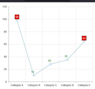
This article is an example of creating a customised visual label in a Kendo Chart Component. The framework used is Kendo UI for jQuery. In this example, our requirement is to show values inside a red box if it is greater than 50. Emphasizing that the value needs to be looked into so to speak.

What we need to do is implement a function for the visual option. We call the createVisual() function to save us from computing where to put the label. This will give us the bounding box coordinates for our label and rectangle. When we have the coordinates, we utilise Kendo's drawing API to draw the text and rectangle and return it as a Group object.

Here is our solution. You can edit the code below using any text editor but I prefer Visual Studio Code. Make sure you are connected to the Internet because the code pulls the Kendo library from the Telerik CDN. Take note that this is just a demonstration code and you'll need to purchase a license if you are going to use Kendo UI for jQuery for more than just evaluation purposes.

Result:

Kendo Chart Custom Visual Label


There you have it. A quick and simple example of how to create a custom visual label in Kendo Chart.

Saturday, May 22, 2021

Kendo Chart Smart Step Example

This article is an example of dynamically changing the step of the category labels in a Kendo Chart Component. The framework used is Kendo UI for jQuery. In this example, our requirement is to show the category labels of the bar chart without overlapping.

If you have a lot of bars in a chart with long category labels, there is strong chance of the labels overlapping. There is already a Kendo Chart documentation on how to prevent the categoryAxis from overlapping. The three workarounds are:

  • Rotating the labels through categoryAxis.labels.rotation.angle
  • Using label templates through categoryAxis.labels.template
  • Reducing the number of displayed labels through step and/or skip

The above workaround could work if we didn't need to zoom in and out of our chart. In order for our Kendo Chart to look pretty (lables not overlapping), we need to make the label step smart. In our solution, we calculate an initial step so that the labels don't overlap. When the chart is zoomed in or out, we recalculate the step and redraw tha chart. One thing to note here is that we need to have a name for our category axis so that we can get the min and max axis ranges.

Here is our solution. You can edit the code below using any text editor but I prefer Visual Studio Code. Make sure you are connected to the Internet because the code pulls the Kendo library from the Telerik CDN. Take note that this is just a demonstration code and you'll need to purchase a license if you are going to use Kendo UI for jQuery for more than just evaluation purposes.

Without a smart step:

Kendo Chart Smart Step Example
Kendo Chart - labels overlapping


Initial chart with smart step:

Kendo Chart Smart Step Example
Kendo Chart - smart step


Chart mid zoom:

Kendo Chart Smart Step Example
Kendo Chart - smart step (mid zoom)


Chart zoomed in:


Kendo Chart Smart Step Example
Kendo Chart - smart step (zoomed in)

There you have it. A quick and simple example of how to have a smart step Kendo Chart.