Showing posts with label kendo dropdownlist. Show all posts

Tuesday, November 9, 2021

Kendo Grid Using Vue Wrappers Example

This article is an example of how to use the Kendo UI Wrappers for Vue particulary the Kendo Grid. The components in the Kendo UI Wrappers for Vue suite are wrappers of the Kendo UI for jQuery widgets. There is also a Kendo UI Native for Vue suite which has native components designed specially for the Vue framework.

What prompted me to write this article is a StackOverflow question. I answered this using Kendo UI jQuery but in this article I will implement it using Kendo UI Wrappers for Vue. The original poster is asking how to display either a drop down list or a text box in each cell under a column. Let's go!

To begin, include all the required Kendo styles, libraries, and the specific Kendo Vue package. See the head part of the HTML below. What was loaded? CSS files, jQuery, Kendo, Babel, Vue and the specific Kendo Grid wrapper for Vue.

Let's go to the body. We start off with a div with an id. Inside this div, we place the kendo-grid directive. To configure the grid, we utilize the Kendo Grid for jQuery API configuration options as props but with a slight naming change. :selectable="'cell'" is an example of setting the prop in an API-based options way. This equates to the selectable configuration option in Kendo Grid for jQuery. Another option is called the Camel-Case wherein Camel case options in jQuery are converted to Kebab case (e.g. dataSource to data-source). The columns are configured using the kendo-grid-column directive. Now that we are happy with the configuration, it's time to instantiate the Vue app.

We instantiate our Vue app and attach it to the div named grid. The data option returns an object with a localDataSource field which is then bound to the prop :data-source="localDataSource".

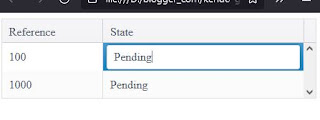
And in the methods option is where all the magic happens. The notEditable function simply returns false so that the cell will not be editable. In the customEditor function, for example purposes, if the reference is greater than 999 a drop down list is displayed otherwise a text box is displayed. We are using the Kendo Vue Wrappers version of the grid and this is why the custom editor is defined using Kendo UI for jQuery. If we want to go to a pure Vue implementation then we will have to switch to the Kendo UI Native for Vue suite.

Here is our code. You can edit the code below using any text editor but I prefer Visual Studio Code. Make sure you are connected to the Internet because the code pulls the Kendo library from the Telerik CDN. Take note that this is just a demonstration code and you'll need to purchase a license if you are going to use Kendo UI Wrappers for Vue or Kendo UI for jQuery for more than just evaluation purposes.

Output:

Kendo Grid Using Vue Wrappers Example
Kendo DropDownList and Grid
Kendo Grid Using Vue Wrappers Example
Kendo Textbox and Grid

There you have it. A simple example of a Kendo Grid implemented with Kendo UI Wrappers for Vue.

Sunday, October 31, 2021

Kendo DropDownList Hide Selected Option Example

This article is another example of the Kendo DropDownList Component. The framework used is Kendo UI for jQuery. This example stems from the StackOverflow question which I answered.

The original poster wanted to hide the selected option in the drop down list. For example, we have 5 items on the list. Namely, apples, mangoes, grapes, papaya, and banana. When a user selects apples, the drop down list will only show mangoes, grapes, papaya, and banana. The OP's idea was to remove the item from the data source. In our solution, we just hide whatever is selected. There is no need to remove the item from the data source. This idea is based on a previous article I have written, Kendo DropDownList Example. So on the open, we get what was selected and then hide. Simples.

Here is our solution. You can edit the code below using any text editor but I prefer Visual Studio Code. Make sure you are connected to the Internet because the code pulls the Kendo library from the Telerik CDN. Take note that this is just a demonstration code and you'll need to purchase a license if you are going to use Kendo UI for jQuery for more than just evaluation purposes.

Here is how it would look like:

Kendo DropDownList Hide Selected Option Example
Kendo DropDownList Example

There you have it. A simple example on how to hide a selected option from the list using the Kendo DropDownList component.

Sunday, January 31, 2021

Kendo Menu With DropDownList Example

This article is an example of the Kendo Menu and DropDownList Component. The framework used is the Kendo UI for jQuery. In this example, we are tasked to create a menu that has a drop down list option.
Here are the requirements:

  1. A search menu.
  2. The menu contains two type of searches. Simple and advance.
  3. The advance search has a type option list.

Here is our solution. You can edit the code below using any text editor but I prefer Visual Studio Code. Make sure you are connected to the Internet because the code pulls the Kendo library from the Telerik CDN. Take note that this is just a demonstration code and you'll need to purchase a license if you are going to use Kendo UI for jQuery for more than just evaluation purposes.

<!DOCTYPE html>
<html>
<head>
    <meta charset="utf-8"/>
    <title>Kendo UI Menu with DropDownList Example</title>

    <link rel="stylesheet" href="https://kendo.cdn.telerik.com/2020.2.617/styles/kendo.default-v2.min.css"/>

    <script src="https://code.jquery.com/jquery-1.12.4.min.js"></script>
    <script src="https://kendo.cdn.telerik.com/2020.2.617/js/kendo.all.min.js"></script>
</head>
<body>
  
  <ul id="menu">
    <li>Search
      <ul>
        <li>
          <div style="display: flex">
            <input placeholder="Simple search" type="text" class="k-textbox">&nbsp;
            <button class="k-primary" title="Execute the search">
              <span class="k-icon k-i-search"></span>
            </button>
          </div>
        </li>
        <li class="k-separator"></li>
        <li>
          <div>
            <input id="searchTypes"></br>
            <div style="display: flex">
              <input placeholder="Advance search" type="text" class="k-textbox">&nbsp;
              <button title="Execute the search">
                <span class="k-icon k-i-search"></span>
              </button>
            </div>
          </div>
        </li>
      </ul>
    </li>
  </ul>
<script>
$(document).ready(function() {
  $("#menu").kendoMenu({
    animation: false,
  });

  $("#searchTypes").kendoDropDownList({
    dataSource: {
      data: ["Type 1", "Type 2", "Type 3", "Type 4"],
    },
    open: function(e) {
      $("#menu").find("ul.k-group.k-menu-group")
        .css("overflow", "visible");
    }
  });
});
</script>
</body>
</html>

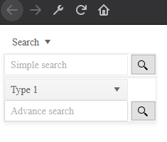
Open the HTML file in a browser and you should see an output similar to the one shown below.

Kendo Menu with DropDownList


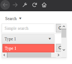
If we don't handle the CSS in the open event then it would look like this. Go ahead try it.

Kendo Menu with DropDownList not fully visible


When we handle the CSS in the open event then it will look the one below.

Kendo Menu with visible DropDownList

There you have it. A quick and simple example of how to use the Kendo Menu with DropDownList component.


Saturday, January 9, 2021

Kendo DropDownList Example

This article is an example of the Kendo DropDownList Component. The framework used is the Kendo UI for jQuery. In this example, we are tasked to create a drop down list.

Here are the requirements:

  1. Have a separator between the options.
  2. Don't show the "Select Option" text with the list.

Here is our solution. You can edit the code below using any text editor but I prefer Visual Studio Code. Make sure you are connected to the Internet because the code pulls the Kendo library from the Telerik CDN. Take note that this is just a demonstration code and you'll need to purchase a license if you are going to use Kendo UI for jQuery for more than just evaluation purposes.

<!DOCTYPE html>
<html>
<head>
    <meta charset="utf-8"/>
    <title>Kendo UI DropDownList Example</title>

    <link rel="stylesheet" href="https://kendo.cdn.telerik.com/2020.2.617/styles/kendo.default-v2.min.css"/>

    <script src="https://code.jquery.com/jquery-1.12.4.min.js"></script>
    <script src="https://kendo.cdn.telerik.com/2020.2.617/js/kendo.all.min.js"></script>
</head>
<body>
  
<input id="customers" style="width: 400px" />
<script>
    $(document).ready(function() {
        $("#customers").kendoDropDownList({
            dataTextField: "option",
              optionLabel: "Select Option",
            height: 400,
            dataSource: {
                data: [
                  {group: "group1", option: "Sum"},
                  {group: "group1", option: "Count"},
                  {group: "group1", option: "Average"},
                  {group: "group1", option: "More Aggregate Options"},
                  {group: "group2", option: "Index"},
                  {group: "group2", option: "% of Grand Total"},
                  {group: "group2", option: "More Calculation Options"},
                  {group: "group3", option: "Number Format"}
                ],
                group: { field: "group" }
            },
          open: function (e) {
           $('.k-group-header').css("display", "none");
           $('.k-group').css("display", "none");
           $('.k-list-optionlabel').css("display", "none");
          }
        });
    });
</script>

</body>
</html>

Open the HTML file in a browser and you should see an output similar to the one shown below.

Kendo DropDownList
Kendo DropDownList Example


If we don't handle the open event then it would look like this. Go ahead try it.

Kendo DropDownList
Kendo DropDownList


There you have it. A quick and simple example of how to use the Kendo DropDownList component.