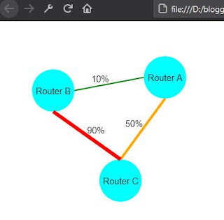
This article is an example of the Kendo Diagram Component. The framework used is the Kendo UI for jQuery. In this example, we are tasked to show the level of traffic between routers.
Here are the requirements:
- If the traffic high, above 80%, show a red thick connection between routers.
- If the traffic is medium, above 40%, show an orange medium thickness connection.
- If traffic is low, show a green thin connection.
Here is our solution. You can edit the code below using any text editor but I prefer Visual Studio Code. Make sure you are connected to the Internet because the code pulls the Kendo library from the Telerik CDN. Take note that this is just a demonstration code and you'll need to purchase a license if you are going to use Kendo UI for jQuery for more than just evaluation purposes.
On the change event, we capture the connections and redraw it accordingly.
<!DOCTYPE html>
<html>
<head>
    <meta charset="UTF-8">
    <title>Kendo Diagram Connection Example</title>
    <link rel="stylesheet" href="https://kendo.cdn.telerik.com/2021.1.119/styles/kendo.default-v2.min.css"/>

    <script src="http://code.jquery.com/jquery-3.5.1.min.js"></script>
    <script src="https://kendo.cdn.telerik.com/2021.1.119/js/kendo.all.min.js"></script>
</head>

<body>
    <div id="diagram"></div>
<script>
$("#diagram").kendoDiagram({
    editable: {
        remove: false,
        resize: false,
        tools: false,
    },
    zoomRate: 0.5,
    zoomMax: 1.5,
    zoomMin: 0.6,
    dataSource: [
        {id:'a', name:'Router A'},
        {id:'b', name:'Router B'},
        {id:'c', name:'Router C'},
    ],
    connectionsDataSource:[
        {from:'a', to:'b', traffic: 10},
        {from:'a', to:'c', traffic: 50},
        {from:'b', to:'c', traffic: 90},
    ],
    layout: {
        type: 'force',
        nodeDistance: 200,
    },
    shapeDefaults: {
        type: 'circle',
        fill: '#00ffff',
        content: {
            template: '#= name #'
        },
        width: 70,
        height: 70,
        hover: {
            fill: '#6495ed'
        },
        editable: {
            connect: false,
            tools: false,
        },
    },
    connectionDefaults: {
        type: 'polyline',
        editable: false,
        content:{
            template: '#= traffic#%',
        }
    },
    change: function(e) {
        for (let i = 0; i < e.added.length; i++) {
            if (e.added[i] instanceof
                kendo.dataviz.diagram.Connection) {
                var traffic = e.added[i].dataItem.traffic;
                var color = 'green';
                var thickness = 2;
                if (traffic > 80) {
                    color = 'red';
                    thickness = 6;
                } else if (traffic > 40) {
                    color = 'orange';
                    thickness = 4
                }

                e.added[i].redraw({
                    stroke: {
                        color: color,
                        width: thickness,
                    }
                });
            }
        }
    },
});
</script>
</body>
</html>
Open the HTML file in a browser and you should see an output similar to the one shown below.
 |
| Kendo Diagram Connection |
There you have it. A quick and simple example of how to use the Kendo Diagram with custom connections.