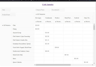
This article is an example of a responsive Kendo PivtoGrid Component. The framework used is Kendo UI for jQuery. Some Kendo widgets do not automatically resize and PivotGrid is one them. In this example, we will make the Kendo PivotGrid fit the browser viewport. In other words, we will make sure that the browser will not provide a vertical scroll bar. Instead, our Kendo PivotGrid will provide the scroll bars. Another additional requirement is that the user should not be able to change the columns, rows and measures of our Kendo PivotGrid.
Firstly, our data can be downloaded here - products.js. We then save it in the same directory as our HTML file.
To address the additional requirement, on dataBound we disable the pivot grid settings and remove the delete and close icons.
The meat of our responsiveness happens in resizeContent. Here we get the height of our viewport and our desired Kendo PivotGrid height. We then set the pivot grid wrapper element to the desired height. Next, change the pivot grid object's height via setOptions. Finally, call the resize method.
The thing that drives the resizeContent function is my new favorite API for the week. The ResizeObserver Web API. Our ResizeObserver object observes changes to the size of the pivot grid element. When the dimensions change, it calls resizeContent.
Here is our solution. You can edit the code below using any text editor but I prefer Visual Studio Code. Make sure you are connected to the Internet because the code pulls the Kendo library from the Telerik CDN. Take note that this is just a demonstration code and you'll need to purchase a license if you are going to use Kendo UI for jQuery for more than just evaluation purposes.
Try resizing the browser. The Kendo PivotGrid should look something like below.
 |
| Responsive Kendo PivotGrid |
There you have it. A quick and simple example of a responsive Kendo PivotGrid.