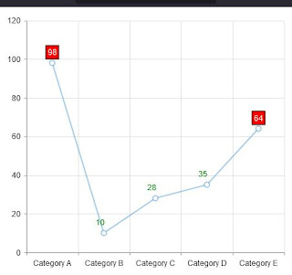
This article is an example of creating a customised visual label in a Kendo Chart Component. The framework used is Kendo UI for jQuery. In this example, our requirement is to show values inside a red box if it is greater than 50. Emphasizing that the value needs to be looked into so to speak.
What we need to do is implement a function for the visual option. We call the createVisual() function to save us from computing where to put the label. This will give us the bounding box coordinates for our label and rectangle. When we have the coordinates, we utilise Kendo's drawing API to draw the text and rectangle and return it as a Group object.
Here is our solution. You can edit the code below using any text editor but I prefer Visual Studio Code. Make sure you are connected to the Internet because the code pulls the Kendo library from the Telerik CDN. Take note that this is just a demonstration code and you'll need to purchase a license if you are going to use Kendo UI for jQuery for more than just evaluation purposes.
Result:
 | |
| Kendo Chart Custom Visual Label |
There you have it. A quick and simple example of how to create a custom visual label in Kendo Chart.
No comments:
Post a Comment